
Great insights lead to great action—but your insights are only as good as the feedback you’re getting. And great feedback starts with your surveys. SMG is dedicated to researching and testing every aspect of survey design—from invitation methods and incentives to the inner workings of survey functionality. All of it matters, and we’re here to help make sure your survey is working hard for your brand.
This starts with setting your scale for success. In part one of this two-part series on survey design best practices, you’ll find SMG’s research on survey scale methodology and our recommendations to yield the most accurate customer feedback for analysis.
Survey Design Best Practice #1: The five-point ordinal rating scale
SMG’s customer experience surveys use a five-point, ordinal rating scale. The ordinal rating scale is easy to use and interpret, as it provides us with two pieces of information:
- Magnitude — How different respondent ratings are from one another
- Direction — Whether one respondent rating is more positive or negative than another

This scale also lets each question be independent. For example, rather than asking a respondent to rank various aspects of an experience relative to one another, this scale allows the respondent to provide an independent rating for each aspect of the experience (Fink, 2013; Dilliman et. al, 2014; Gravetter & Wallnau, 2014).
This is particularly useful in customer experience surveys, because it allows researchers to ask respondents about individual attributes of the experience (e.g., quality of food or merchandise, employee friendliness) and use the resulting data to conduct multiple regression analysis. This analysis is critical in determining the strength of the relationship between these individual attributes and Overall Satisfaction and the relative importance of each in driving satisfaction and loyalty.
What about ranking scales? 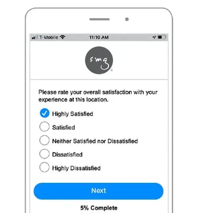
When questions employ a ranking scale, respondents are asked to order the responses from “most” to “least.” This can be a challenge for respondents, as we find they typically don’t hold strong views beyond one or two items. In addition, respondents may choose to assign equal ranks to response categories, which makes analysis difficult (Andres, 2012; Krosnick, 1991, 2010).
Ranking scales are also methodologically problematic. The rank of one item is not independent of the other items, as the prior ranking determines the relative ranks of the remaining items. This leads to negative correlation bias, which is when one variable increases or decreases and the other variable moves in the opposite direction. Although questions using rating scales are susceptible to positive response bias, responses to each question are independent, and hence preferable. Also, in practice, questions using rating scales are easier for respondents to answer (Andres, 2012; Krosnick, 1991, 2010).
What about emoji, star, and thumb ratings?
As technology continues to evolve how we communicate, SMG researchers constantly evaluate new ways to innovate our survey design best practices without compromising data validity, accuracy, and comparability. While the academic research on alternative scales is ongoing, SMG has tested numerous approaches to ensure clients remain at the forefront of measurement best practices.
Generally speaking, the traditional five-point scale wins out in head-to-head assessments for several reasons. When compared to alternatives like emoji, stars, and thumbs up/down ratings, it is the most straightforward, objective scale—allowing less room for interpretation across respondents. The more visual alternative scales may not only unintentionally influence ratings, but also mask the distinction in scores. Furthermore, properly wording questions for alternative scales can be challenging, and some alternative scales are limiting to the questions that can be asked (Barlas, 2017). Finally, our tests revealed no substantial impact on engagement or participation rates for alternative scales.
While SMG also tested adding gradated color schemes to the anchored point scale, with red representing low scores and green representing high scores, research has shown colors can impact the perceived severity of the different options (Brownell, 2018). For these reasons, the traditional five-point scale continues to be SMG’s recommended approach.
Why a five-point scale?
There is consensus that scales should contain no more than seven response categories, but five is probably sufficient (Andres, 2012; Dillman et al., 2014). In principle, the more points a rating scale offers, the more information a researcher can learn about the distinctions between responses. However, the magnitude of incremental gain decreases once a sufficient number of categories are used (Fink, 2013).
SMG recommends limiting to a five-point scale to make responding easier for consumers. A five-point scale is cognitively less demanding, which limits respondent fatigue. In addition, a significant number of web surveys are taken on mobile devices, making the five-point scale even more critical given smaller screens and shorter attention spans.
The five-point scale also provides a neutral midpoint, which is preferable over the popular 1-to-10 scale with an even number of scale points. An even number of choices forces respondents to choose a side. In contrast, the five-point scale gives the respondent the option of “sitting on the fence,” providing more information to us rather than no information at all—which is what often happens when respondents don’t have a midpoint and choose not to answer a question (Andres, 2012; Krosnick, 2010).
It’s important to anchor
SMG’s best practice is to anchor all scale points. That is, we give each point on the scale a label.

Anchored scales are preferred by respondents and have higher reliability and predictive validity than numeric scales. Fully labeled scales are also cognitively easier for respondents (Andres, 2012; Smith & Albaum, 2005). For example, scales marked “1 to 5, with 5 being the highest” result in less accurate results than scales with labels such as “satisfied” or “dissatisfied.”
If numbered scales are used, we recommend using labels in addition to numeric ratings (e.g., “highly satisfied” above 5, “neither satisfied or dissatisfied” above 3, and “highly dissatisfied” above 1). In doing so, all of the points are standardized through use of words, which makes it more likely for all respondents to interpret the scale in the same way (Smith & Albaum, 2005; Tourangeau, et al., 2007).
An additional advantage of using a fully anchored scale is that it provides clear information to the respondent as to what each scale point means. Research has shown scales that only have some points labeled result in lower data quality, as respondents tend to gravitate toward the scale points with labels (Smith & Albaum, 2005; Tourangeau, et al., 2007).
The importance of anchoring further supports SMG’s best practice of using a five-point scale—providing labels for more than five points can be problematic due to space and the ability to differentiate through words.
Survey Design Best Practice #2: Satisfaction scales
Customer experience surveys aim to measure self-reported satisfaction at a single point in time. There are two reasons why SMG uses a satisfaction scale to accomplish this:
- The scale directly asks about the level of satisfaction, which is what we want to measure.
- The scale conveys to an organization’s customers that their satisfaction is the main concern.
Our recommended satisfaction scale makes use of these five points, in this order: Highly Satisfied, Satisfied, Neither Satisfied nor Dissatisfied, Dissatisfied, Highly Dissatisfied. We find this order to be preferable, as research suggests respondents follow logical interpretation of visual scales — meaning they instinctively believe “up means good” (on a vertical scale) or “left means good” (on a horizontal scale) when completing surveys (Tourangeau, et al., 2007). In addition, our own research has proven respondents make errors more often when the scale is ordered from negative to positive (“highly dissatisfied” to “highly satisfied”), than when the scale is ordered from positive to negative (“highly satisfied” to “highly dissatisfied”).
Agree/disagree scales are not ideal because they encourage acquiescence response bias, which is the respondent tendency to agree with any statement or endorse any assertion regardless of its content (Krosnick, 2010). There are two primary arguments for why this bias occurs:
- Some people are predisposed to be polite and avoid social friction. Thus, they tend to be more agreeable, which means we’re measuring their agreeableness rather than their satisfaction.
- There’s a general bias in hypothesis testing toward confirmation rather than disconfirmation, which means respondents are inclined to agree with assertions presented in agree/disagree format (Krosnick, 1991, 2002, 2010).
Thus, it is SMG’s best practice to use the satisfaction scale. However, we don’t reject the use of other scales. In fact, many customer experience surveys use highly likely/not at all likely and agree/disagree scales in addition to the satisfaction scale. However, when the objective is to measure satisfaction of a customer’s experience, our best practice is to use the satisfaction scale and limit the use of agree/disagree scales.
Is it ever right to stray from these best practices?
While this paper covers best practices proven in research literature and from our own experience, there are certainly cases when it’s appropriate to veer from them. Most commonly, we recommend a variation on best practices when historical data and organizational alignment are particularly important for our clients. We understand not every program is starting from a completely blank slate, and it’s often necessary to take a modified approach.
Conclusion
Following best practices in survey design starts with choosing the appropriate scale and including those important elements described above that allow the scale to be successful. Doing so yields the most accurate customer feedback for analysis. SMG’s experience with clients and extensive research on survey design offer best practices on developing surveys that are more impactful because of the more accurate data that is collected. While the science is helpful and constructive, the art of survey design is knowing how to implement best practices in any given survey situation.
References
Andres, L. (2012). Designing and Doing Survey Research. Thousand Oaks, CA: Sage Publications.
Barlas, F. Thumbs up or down: Can emojis help make surveys smartphone friendly? https.blog.gfk.com. Web. April, 25, 2017.
Brownell, B. Do Colours Affect Survey Responses. https://insightrix.com/colours-affect-survey-responses/. Web. July, 25, 2017.
Dillman, D.A., Smyth, J.D., Christian, L.M. (2014). Internet, Phone, Mail, and Mixed-Mode Surveys: The Tailored Design Method (4th Edition). Hoboken, NJ: John Wiley and Sons, Inc.
Fink, A. (2013). How to Conduct Surveys: A Step-by-Step Guide (5th Edition). Washington, DC: Sage Publications.
Gravetter, F. J. & Wallnau, L. B. (2014). Essentials of Statistics for the Behavioral Sciences (8th edition). Belmont, CA: Wadsworth.
Krosnick, J.A. (1991). Response Strategies for Coping with the Cognitive Demands of Attitude Measures in Survey. Applied Cognitive Psychology, 5, 21–236.
Krosnick, J.A., Holdbrook, A.L., Berent, M.K., Carson, R.T., Hanemann, W.E., Kopp, R.J., et al. (2002). The impact of “No Opinion” Response Options on Data Quality: Non-Attitude Reduction or an Invitations to Satisfice?” Public Opinion Quarterly, 66(3), pp. 371–403.
Krosnick, J.A. (2010). Comparing Questions with Agree/Disagree Response Options to Questions with Item-Specific Response Options. Survey Research Methods 4(1), pp. 61–79.
Miller, H., Thebault-Spieker, J., Chang, S., Johnson, I., Terveen, L., Hecht, B. (2016). “Blissfully happy” or “ready to fight”: Varying Interpretations of Emoji. International AAAI Conference on Web and Social Media.
Smith, S.M. & Albaum, G.S. (2005). Fundamentals of Marketing Research. Thousand Oaks, CA: Sage Publications.
Tourangeau, R., Couper, M.P., Conrad, F. (2007). Color, Labels, and Interpretive Heuristics for Response Scales. Public Opinion Quarterly, 71(1), pp. 91–112.